Product Images That Don't Byte with the Next.js Image Component


Images and media are what make the web special. Being able to visit your favorite online shop and see what a product actually looks like before buying it can give you confidence when spending your hard-earned money.
But when those images take forever to load, you get frustrated. And when people visit your online store and experience a page that takes a long time to load, they get just as frustrated as you do.
Why does performance matter with ecommerce?
Performance matters no matter the type of project. Providing a good user experience should be fundamental to anything we build. But it becomes even more critical to a business when dealing with an online store.
Every byte you serve can have an impact as to whether the person on the other end of the browser will wait for that page to load or if they'll stop wasting their time and move on to something else.
As shown by eBay and countless other studies, page speed matters! eBay particularly saw that by improving the load time of their site by 100ms, they increased the amount of times people added a product to their cart by 0.5%.

While 0.5% doesn’t really seem like a lot, consider the scale of eBay. In 2020, eBay saw $30.74 billion in sales. 0.5% of that is $153.7 million. That's still a lot of money!
Consider that’s also only a 100ms improvement. For some projects, there could be easy wins that could shave off over a full second from the load time. For smaller shops, that can make a big difference!
The bottom line is performance directly correlates to conversion. Paying attention to how long it takes to load your site is more than just a better user experience, it’s helping to bring more sales.
How can the Next.js Image Component help?
Among a variety of other components Next.js provides out-of-the-box, the Image Component is an extension of the HTML img element that wraps additional capabilities like image optimization, automatically serving images in modern formats, and responsiveness.
While you’ll often see site generators build these images at compile time, Next.js instead serves these images as the page requests them, being able to provide intelligent loading for those assets.
Because Next.js dynamically serves these images for each request, the default configuration won’t let you statically generate the images for your site with
next export.
By using the Next.js Image Component, you can add the images to your project just like you would the standard img tag and be confident that you’ll be serving optimized images to your website visitors.
How to use the Next.js Image Component
To show how this works, I bootstrapped a new app with Create Next App.
I like space, so I added a picture of a galaxy to my app using a picture from nasa.gov.

That image looks pretty cool, but that image’s size is 2.9mb! That’s huge! But that’s kind of expected given it’s the raw image at a resolution of 4060x2117.
Now moving that to a Next.js Image, I don’t really have to do much.
At the top of the page, we can import the Image component:
Then we can update our img tag to the Next.js Image Component.
Using the Image Component is much like using the standard HTML img tag. There are a few required attributes:
src: path to your imagewidth: width in pixels as a number (no units)height: height in pixels as a number (no units)
You can also use external links as the source of your image, but you need to configure it in your
next.config.js.
We already have all of those values set, so with our image, we can change it from the img tag to the Image Component:
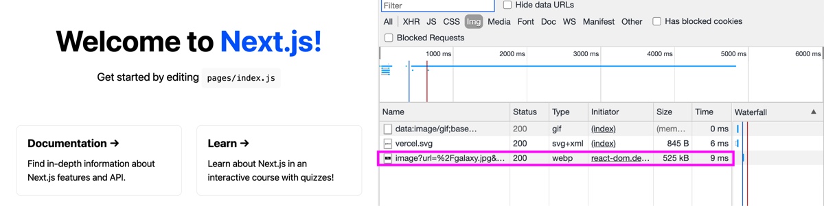
Now when trying to load the image in the browser, the image dropped down from 2.9mb to 799kb!

If you look closely, you can also see that the image is now being served as WEBP instead of a JPG, a modern image format for the web.
While this is a bit extreme of an example (typically we should be more conscious about the size of the images we load), this could realistically happen in scenarios where you’re not the one managing the images getting added or someone simply forgot to check how big that image was before dropping it in.
Without much work, we’re providing an optimized image that was converted from JPG to WEBP. Pages now require less content for visitors to download which result in faster page load speeds.
Making our Next.js images responsive
The Image Component comes with a few other props and options out of the box, one being the layout prop.
By setting the layout, we can tell Next.js how to display the image, whether it’s:
fixed: won't resizeintrinsic: will shrink, but won't grow past original dimensionsresponsive: will scale the image up and down, including the sizefill: will fill the image to the size of the parent element
The interesting option to us here is to set layout to responsive. Not only will our image resize as the viewport changes, Next.js will provide a srcset attribute which will load different images at different sizes depending on how big the viewport is.
To try this out, we can add the prop to our Image Component:
If you’re following along with the Create Next App, if you try to reload at this point, you’ll actually see our image disappears.
The issue, is when Next.js tries to make the Image responsive, it bases that responsiveness based off of the parent. Because by default in our app, our containing div doesn’t have a width set, whether a fluid width or fixed, our responsive image can’t find space to fill.
For our example, we can fix this by setting a width of 100% on our div:
And now if we reload the page, we can see our image again.

The cool part though, looking at the source, Next.js is now dynamically setting the srcset attribute along with a few different versions of our image.

That means, the browser will be able to dynamically load different image sizes depending on the size of the browser. If our visitor is on a smaller device, they won’t have to load the same large images as visitors on a desktop!
Driving more sales with a better UX
Images are just one part of how we can focus on providing a better user experience to our visitors. Not paying attention to your images could lead to serving your customers huge images, costing them bandwidth and time. This leads to costing you and your business sales.
Fortunately, Next.js makes this easy with the Image component, allowing us to spend more building beautiful experiences while the framework robots do the hard work.